COVID-19 Cohorts in Log Scale. Why is dbt Important? The Publication Process in ML. Visual SQL. [DSR #221]
Quite a week… Stay safe and healthy everyone, and focus the health and safety of your families and communities.
- Tristan
❤️ Want to support this project? Forward this email to three friends!
🚀 Forwarded this from a friend? Sign up to the Data Science Roundup here.
This week's best data science articles

Coronavirus, a Visual Rundown | FlowingData
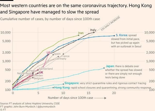
FlowingData has a great post out with an overview of the great data visualization work done around the COVID-19 pandemic. I’m sure you’ve been inundated with news about the coronavirus and so will forgive you if you don’t need to read another post, but I thought the above graph was definitely the best and most interesting presentation of relevant data that I’d seen. It’s fascinating to see both a) how consistent the spread is in so many countries that are so culturally different from one another, and b) how dramatically different it is in a very specific few. Tells such a clear story about the efficacy of aggressive response.

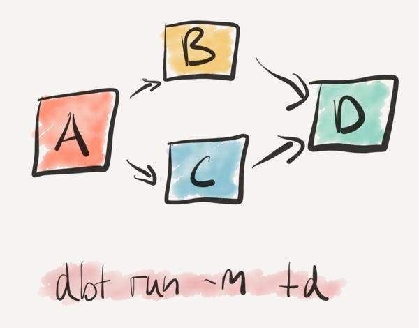
Last summer, we migrated Monzo’s entire analytics infrastructure to dbt from a homegrown solution. This took significant effort, but I’m glad we did it. This post explains why we took a bet on dbt, and why I think it’s one of the most important data tools around.
Stephen Whitworth ran the initial dbt implementation at Monzo and we’ve spent a ton of time with he and his team since then. It’s been a real pleasure—the Monzo team has made a huge investment in dbt and we’re incredibly excited to have found such a group of smart, invested users to partner with.
This article demonstrates just how much Stephen and the team there really grok what we’re trying to do with dbt’s product design. dbt isn’t complicated, instead it’s designed to make a lot of typical data transformation problems just kind of vanish if you work in the way the tool wants you to. Stephen does a fantastic job of describing the core principles. Want more from Monzo? Watch the video below.

Monzo + dbt: Increasing analytics velocity
Fostering a Culture of Sponsorship @ Uber
Ok this is obviously a bit of corporate PR on the Uber engineering blog, but I wanted to use it to plant this seed in all of your brains. The topic of data analyst career paths has come up recently, and one of the things that hasn’t been talked about is mentorship / sponsorship.
In many career paths, mentorship and sponsorship are absolutely critical for the development of junior staff. One mentor can make the critical difference to set a career path off on a completely different trajectory—this impact cannot be understated.
The hard part about this on data teams is that a) they are often small-ish, and b) there aren’t many folks working in data today that have over a decade of experience, which is often where you draw your mentor/sponsor cohort from. As such, mentorship within data teams isn’t often done: I’m not sure I’ve ever spoken to a data team that has something explicitly in place to support this, whereas it’s fairly common on leading engineering teams.
I have a suggestion and a question. The suggestion: skills needed on the data team aren’t purely data-related. As such, it’s totally relevant for a senior practitioner from another related function provide mentorship to someone on the data team. The question: what have you seen on this topic? Does your data team have a formal mentorship / sponsorship program set up? What has and hasn’t worked? I’d love to hear from you.
Yoshua Bengio: Time to rethink the publication process in machine learning
Yoshua Bengio thinks that the current ML conference publishing cycle is having adverse impacts on the industry as a whole and wants to fix it. While I am not an ML researcher and so don’t have the opportunity to see this from the inside, I completely believe that career incentives for grad students and academics can cascade and produce suboptimal outcomes for all involved. Industry-wide change is necessary to solve this class of problems.
While I hadn’t considered this specific cause before, I have felt like the increase in volume of papers in recent years has come at the expense of many of them seeming rather incremental, which is echoed here as a symptom.
Chartio: We Made SQL Visual - Why and How
This product release from Chartio made the top of Hacker News this week. It’s an interesting product, and I’ll be the first to admit that I’m not the target user for it (likely nor are you). From the playing around that I’ve done it’s certainly worth a look, although I did hit dead-ends that I personally couldn’t’ figure my way out of. YMMV.
The reason I think this is interesting is that it’s a part of a larger trend. Products have been promising more business-user-level access to data for a long time (decades!), but none have ever really delivered. Fundamentally, this is because there has always been a complexity limitation inherent in these products and if you wanted to go deeper you had to move into code / gnarly data prep tools. I personally believe that over the next five years we’ll start to see tiered strategies that let users of all skill levels operate on data at the level of cleanliness / curation that is appropriate for them, paired with an appropriate interface.
You, as a more technically sophisticated data user, should still care about this. It will dramatically change your role in your organization.
The other tool in this area that is doing interesting things is Sigma Computing. Their focus is writing SQL from a spreadsheet-style UI.
The Past, Present, and Future of Visualization Recommendation
TLDR: Visualization recommendation systems suggest useful insights to help users more effectively explore and understand their data. In this blog post, we examine a brief history of why these systems were developed, and where we are today, and outline open-challenges for future research.
This follows on nicely from the post above. What if the entire insight-generation process we have today—ask a question, formulate a query, select a chart, search for insight in it—could fundamentally change? What if, instead, a system were able to generate a large number of candidate visualizations from a subset of the data that you defined, and then present them to you in an interface, essentially asking the repeated question “Is this interesting?” The analyst’s role becomes one of broadly defining a question topic and then swiping.
Don’t get me wrong, this is not happening in the very near term. But it’s ahistorical to assume that the current insight-generation workflow will remain static forever. Food for thought :D
Thanks to our sponsors!
dbt: Your Entire Analytics Engineering Workflow
Analytics engineering is the data transformation work that happens between loading data into your warehouse and analyzing it. dbt allows anyone comfortable with SQL to own that workflow.
Stitch: Simple, Powerful ETL Built for Developers
Developers shouldn’t have to write ETL scripts. Consolidate your data in minutes. No API maintenance, scripting, cron jobs, or JSON wrangling required.
The internet's most useful data science articles. Curated with ❤️ by Tristan Handy.
If you don't want these updates anymore, please unsubscribe here.
If you were forwarded this newsletter and you like it, you can subscribe here.
Powered by Revue
915 Spring Garden St., Suite 500, Philadelphia, PA 19123

