Data Science Roundup #85: Experimentation @ Airbnb, Timelines @ Twitter, Data from Instacart
Really interesting stuff out this week from Twitter, Airbnb, Facebook, Instacart. Also: we just launched a brand new site! Feedback very welcome :)
- Tristan
Referred by a friend? Sign up here!
Two Posts You Can't Miss
Scaling Airbnb’s Experimentation Platform
I love so much of the writing and thinking that comes out of the Airbnb data team and this post does not disappoint. This post is trivially about technology, but the real story here is about organizational behavior.
Airbnb has around 500 experiments running at any given point in time and they monitor 50k metrics for those experiments. They invest heavily in the infrastructure and tooling required to deliver this capability organization-wide, and they have tight processes around the workflow. One example:
The Data Engineering team certifies around 50% of metrics. These metrics have an SLA guarantee and changes to their definitions are closely audited.
That is just really cool. I frequently get asked about books on data organizational behavior and, honestly, I don’t love any of the ones I’ve seen. I hope the folks on the data team at Airbnb write one.
Using Deep Learning at Scale in Twitter’s Timelines
Building and deploying timeline algorithms has to be one of the most challenging tasks in all of modern software engineering: complex recommender algorithms deployed at the very large scale with high criticality.
About a month ago, Linkedin published a behind-the-scenes look at the engineering of their feed. This post from Twitter is similar, and it’s even more fascinating: while Linkedin relies on a human-in-the-loop strategy and has a much more defined idea of what “quality” content looks like, Twitter’s problem is honestly a harder one to solve. Its scale is bigger, its content variety is wider, and timeliness is even more important. This post goes surprisingly deep on how the Twitter engineering team thought about the problem and what they actually did to to move to their new, deep-learning-based timeline.
Highly recommended.
This Week's Top Posts
3 Million Instacart Orders, Open Sourced
This is a freaking cool data set:
Instacart is excited to announce our first public dataset release, “The Instacart Online Grocery Shopping Dataset 2017”. This anonymized dataset contains a sample of over 3 million grocery orders from more than 200,000 Instacart users.
The red line in the image is products that are commonly bought late night: almost completely ice cream. I’m very interested to see what other insights are hiding in there! 🥕🍒🍞🥓
New Data Scientist Practitioner Survey
The article is annoyingly written, but the survey data is good:
88% of data scientists say they are happy or very happy with their position—up from 67% in 2015
Nearly 90% of the 179 data scientists surveyed globally said they are contacted at least once a month for new job opportunities, while more than 50% said they are contacted on a weekly basis.
53% of the data scientists surveyed also said they spend most of their time on the parts of the job they like the least: Janitorial tasks, such as cleaning and organizing data, labeling data, and collecting data sets.
0% of you should be surprised by that last quote :)
Are Pop Lyrics Getting More Repetitive?
Short answer: yes. And Rihanna wins the crown for the most repetitive pop artist of all.
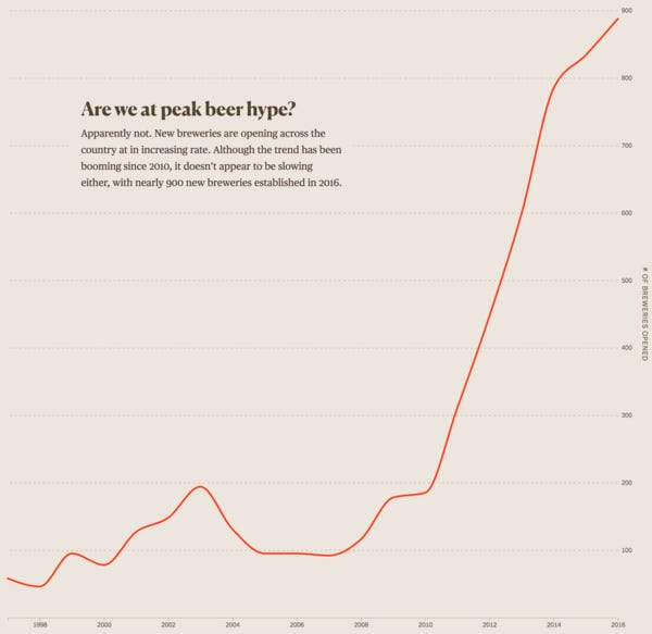
This is an impressive example of both analytical investigation and interactive visualization. There’s lots of other great stuff on this site, too—click around for great work on the NBA draft, microbreweries, and more.
Facebook posts its fast and accurate ConvNet models for machine translation on GitHub
Facebook’s new machine translation models show a modest improvement in performance and a dramatic—9x—improvement in speed. You likely aren’t using machine translation in your day-to-day work, but I found this fascinating because these are the types of optimization numbers that happen at the steepest part of the S curve. We’re right in the middle of it.

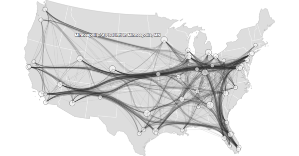
Edge bundling is a cool technique to deal with graph visualization when there are a large number of nodes. For anyone who has ever tried to generate such a chart, you know how messy and meaningless the output can be. Edge bundling pulls multiple similar paths closer together so that your eye can view overall trends more clearly. This link is a great example of how much clearer the resulting output is.
More on edge bundling here and here.
ICLR2017: Deep Thought vs Exaflops
Increasingly, cutting-edge research is being done inside of large tech companies rather than in academia simply as a result of the costs of experimentation. This article outlines the staggering costs of recent experiments and provides suggestions on low-budget areas that are ripe for academic research.
Likely not directly applicable to your day-to-day, but a great overview of this trend.
Data viz of the week

Simple line graph, but it's the perfect answer to the question posed.
Thanks to our sponsors!
Fishtown Analytics: Analytics Consulting for Startups
At Fishtown Analytics, we work with venture-funded startups to implement Redshift, Snowflake, Mode Analytics, and Looker. Want advanced analytics without needing to hire an entire data team? Let’s chat.
Stitch: Simple, Powerful ETL Built for Developers
Developers shouldn’t have to write ETL scripts. Consolidate your data in minutes. No API maintenance, scripting, cron jobs, or JSON wrangling required.
The internet's most useful data science articles. Curated with ❤️ by Tristan Handy.
If you don't want these updates anymore, please unsubscribe here.
If you were forwarded this newsletter and you like it, you can subscribe here.
Powered by Revue
915 Spring Garden St., Suite 500, Philadelphia, PA 19123

