Dataviz Cheatsheet. Blind Spots. Feature Engineering. The Smile Curve. Building Your Brain Trust. [DSR #148]
Lazy rainy Saturday at home ->> particularly good issue 😊 I got really sucked in this week; there was a lot of good stuff out there to pore through. Hope you enjoy the results!
- Tristan
❤️ Want to support us? Forward this email to three friends!
🚀 Forwarded this from a friend? Sign up to the Data Science Roundup here.
This Week's Most Useful Posts
This data visualization cheat sheet has been making the rounds on Twitter this week. Point your team members here when they send you charts that make you sad 😞

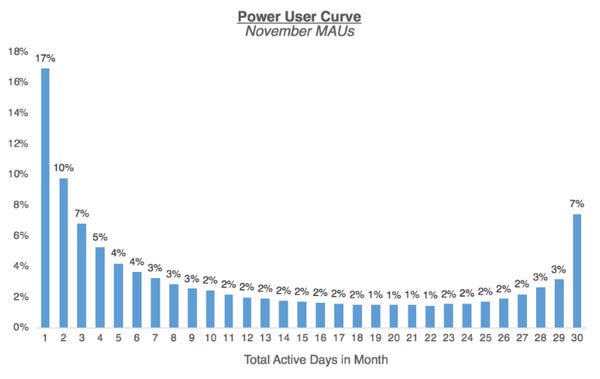
The Power User Curve: The Best Way to Understand Your Most Engaged Users
This a brilliant example of thoughtful metric design. Almost every consumer software product measures daily actives, monthly actives, and the ratio of the two (often called the “stickiness ratio”). But Andrew Chen shows one particular view of DAU data that is both unusual and revealing; he calls it a “smile chart”.
The smile chart (example above) is a simple histogram of # of total active days in a given month. What’s interesting about it here is that it points to important characteristics of your user base. I’ll let him explain in the article, as he does so quite well.
Metric design often feels mundane, but making small changes in the way you’re looking at your data can reveal very different insights about the underlying reality. Don’t just apply the same lens that everyone else is using.
Knowing Your Blindspot as an Analyst
I love this post. It’s short and sweet, and makes a very simple point: as an analyst, you need context for the problems you’re trying to solve, and that context is impossible to get purely from data. Practical experience is critical to understanding a domain.
Derek makes this point via his experience analyzing sales data and then later doing sales himself. I’d take his advice one step further: if you’re assisting any business function by analyzing data, start by actually doing that business function. Shadow sales calls. Run real advertising campaigns (with real budgets!). Help the finance team close the books.
You’ll be shocked at how much more insight you get with an on-the-ground perspective.
blog.modeanalytics.com • Share
Why Automated Feature Engineering Will Change the Way You Do Machine Learning
I’ve covered automated hyperparameter tuning a couple of times recently, as it’s gotten a lot of attention with Google’s AutoML. Automated feature engineering is a bit less commonly discussed. One of the authors of a new Python library, Featuretools, wrote this extensive post on what automated feature engineering is, why it works, and how to implement it using Featuretools.
The post is good, but if you really want to evaluate Featuretools for your own usage (which you should!), I’d dive in to the Jupyter notebooks here. They’re very detailed, and get into exactly what features get created and how.
Automated feature engineering is something I personally want to play around with. I’m just a bit skeptical of the ability of an algorithm that has no contextual knowledge to do what has traditionally been a human task, but that’s just as likely an indicator of my own egocentrism.
towardsdatascience.com • Share
Building Your Analytics Brain Trust
Another great post from dbt user @scottb. In it, he walks you through how to build a “brain trust”: a group of people with whom you can collaborate on tricky data problems. This is something he’s quite good at—Scott has become one of the more connected folks in the NYC data scene.
This is something I’ve spent a lot of time working on as well, and I’m always surprised at just how few data people actually spend any time and energy cultivating these relationships. They can sometimes be the single biggest tool in your belt when solving a tough problem.
www.locallyoptimistic.com • Share
Urban Nation: The Rise of the American City
This is an entire essay based on American population data. Wonderful data-driven exploration of US population dynamics over the past 200 years. Highly recommended.
Partitioning the Variation in Data
Roger Peng writes a better summary of his own post than I could:
Partitioning your data into fixed and random components of variation can be a useful exercise even before you look at the data. It may lead you to discover that there are important features for which you do not have data but that you can go out and collect. Making the effort to collect additional data when it is warranted can save a lot of time and effort trying to model variation as if it were random. More importantly, omitting important fixed effects in a statistical model can lead to hidden bias or confounding. When data on omitted variables cannot be collected, trying to find a surrogate for those variables can be a reasonable alternative.
Thanks to our sponsors!
Fishtown Analytics: Analytics Consulting for Startups
At Fishtown Analytics, we work with venture-funded startups to build analytics teams. Whether you’re looking to get analytics off the ground after your Series A or need support scaling, let’s chat.
Stitch: Simple, Powerful ETL Built for Developers
Developers shouldn’t have to write ETL scripts. Consolidate your data in minutes. No API maintenance, scripting, cron jobs, or JSON wrangling required.
The internet's most useful data science articles. Curated with ❤️ by Tristan Handy.
If you don't want these updates anymore, please unsubscribe here.
If you were forwarded this newsletter and you like it, you can subscribe here.
Powered by Revue
915 Spring Garden St., Suite 500, Philadelphia, PA 19123

