Notebooks at Netflix. A/B Testing @ Etsy. Publishing Your Work. [DSR #149]
❤️ Want to support us? Forward this email to three friends!
🚀 Forwarded this from a friend? Sign up to the Data Science Roundup here.
This Week's Most Useful Posts

Beyond Interactive: Notebook Innovation at Netflix
Oh snap…this is awesome.
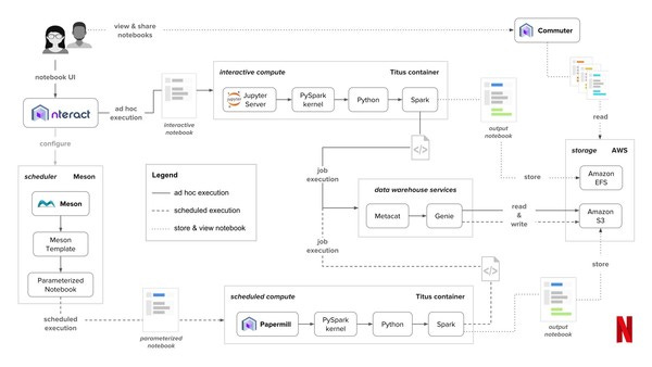
Notebooks have rapidly grown in popularity among data scientists to become the de facto standard for quick prototyping and exploratory analysis. At Netflix, we’re pushing the boundaries even further, reimagining what a notebook can be, who can use it, and what they can do with it. And we’re making big investments to help make this vision a reality.
In this post, we’ll share our motivations and why we find Jupyter notebooks so compelling. We’ll also introduce components of our notebook infrastructure and explore some of the novel ways we’re using notebooks at Netflix.
The post is long, but well worth it. I hadn’t read about any company with quite such an extensive investment in Jupyter before. Very impressive. Make sure to check out the Notebook Infrastructure section—several tools in there worth checking out.
2018 House Forecast | FiveThirtyEight
Every major election cycle, FiveThirtyEight implements new features on their forecasts and the attendant visualizations. I enjoy watching the progress and really think they continue to be leaders of how to analyze and visualize election data. This time around, the new features I see:
“burger menu”: you can personalize what data you want included in your forecasts, from basic to complex. I love this.
Summaries with reduced granularity: “3 in 4” headline on top of a 75.4% caption. Helps with digestibility.
Increased focus on confidence intervals. CIs have always been at the core of their forecasts (obviously), but are now significantly up-leveled in the visualization. This expects more of readers but is a more accurate representation of reality. It is also probably a CYA move after people accused them of “missing” the 2016 election.
Choropleth default instead of geographic map for districts. Emphasizing physical geography distorts the meaningful measure (# of districts) and is now de-emphasized.
Overall, great changes.
projects.fivethirtyeight.com • Share
12 Guidelines for A/B Testing from Etsy
Emily Robinson’s A/B testing post is the single best I’ve read on the topic. This is not entirely surprising: Emily honed her A/B testing skills at Etsy, one of the pioneers of modern online experimentation. In the post, you get a glimpse of Etsy’s experimentation machine, and 12 clear rules for how to run experiments. If you’ve run many A/B tests before, you’ve almost definitely violated most of them at some point (I certainly have).
The Most Important Part of a Data Science Project is Writing a Blog Post
Writing creates opportunities, gives you critical communication practice, and makes you a better data scientist through feedback.
Preach.
If you’re not writing about your work frequently, you absolutely must read this. And then write more.
towardsdatascience.com • Share
9 Things You Should Know About TensorFlow
I feel a little bad about linking to this because it’s such a clear advertisement for TF. But…it’s a good post and a quick read. I actually didn’t realize they had added an eager execution environment! From the docs:
TensorFlow’s eager execution is an imperative programming environment that evaluates operations immediately, without building graphs: operations return concrete values instead of constructing a computational graph to run later.
Seems like a really significant ease-of-use improvement. Many other useful tidbits in the post.
Thanks to our sponsors!
Fishtown Analytics: Analytics Consulting for Startups
At Fishtown Analytics, we work with venture-funded startups to build analytics teams. Whether you’re looking to get analytics off the ground after your Series A or need support scaling, let’s chat.
Stitch: Simple, Powerful ETL Built for Developers
Developers shouldn’t have to write ETL scripts. Consolidate your data in minutes. No API maintenance, scripting, cron jobs, or JSON wrangling required.
End Note
In last week’s issue, The Power User Curve was actually written by Li Jin, not Andrew Chen. It was on Andrew’s blog and the two collaborated on the work, but the authorship ultimately belonged to Li. Apologies! And thanks to DSR subscriber Shawn Purcell for the correction :)
- Tristan
The internet's most useful data science articles. Curated with ❤️ by Tristan Handy.
If you don't want these updates anymore, please unsubscribe here.
If you were forwarded this newsletter and you like it, you can subscribe here.
Powered by Revue
915 Spring Garden St., Suite 500, Philadelphia, PA 19123

