Pipeline Debt. Dashboard Design and Font Choices. Cloud GPU Benchmarks. [DSR #124]
❤️ Want to support us? Forward this email to three friends!
🚀 Forwarded this from a friend? Sign up to the Data Science Roundup here.
More Jobs!
After including several jobs in last week’s newsletter, several other postings from Data Science Roundup readers surfaced (including one from us!):
Zapier: Data Scientist, Growth
La Columbe: Data Analyst
Fishtown Analytics: Data Analyst
Feel free to send yours along; it’s hard finding talent and I’m happy to use this space to help.
The Week's Most Useful Posts
Down with Pipeline Debt / Introducing Great Expectations
TL;DR: pipeline debt is a species of technical debt that infests backend data systems. It drags down productivity and puts analytic integrity at risk. The best way to beat pipeline debt is a new twist on automated testing: pipeline tests, which are applied to data (instead of code) and at batch time (instead of compile or deploy time).
I really love this. Analytics and data science rely on quality data pipelines, and it’s shocking just how infrequently these pipelines are appropriately tested. The article does a wonderful job discussing just how challenging it can be to get this stuff right and the importance of doing so. We do a ton of data testing at Fishtown Analytics and are huge believers.
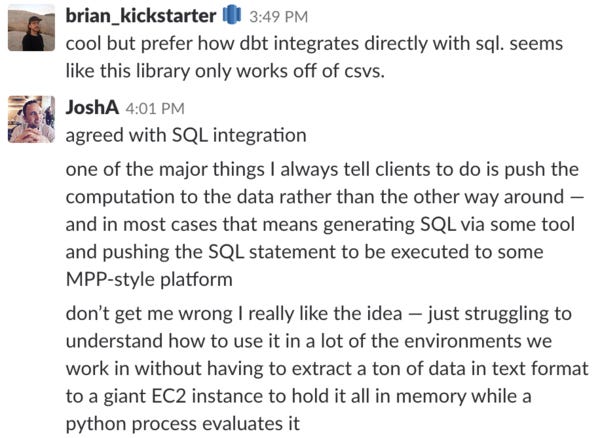
My only quibble with the tool itself is the technical approach it takes. Brian and Josh from dbt slack put it better than I could (below). Even so, I give this team a ton of credit for pushing forward a very important topic.

We believe these values and principles, taken together, describe the most effective, ethical, and modern approach to data teamwork.
Too often, a data team’s efficacy is limited by its organization’s willingness to buy into good data practices. This manifesto is a way for the entire community to rally around how data should be done, providing tremendous social proof for individual data teams implementing these practices.
I signed.

Working on Your Dashboard Layout?
This short and sweet article goes through five principles of web design as applied to dashboard construction. The decisions you make when laying out your dashboard really matter: don’t just vomit up a bunch of charts.
towardsdatascience.com • Share

While we’re on the topic of visual design, font is another area worthy of attention that is often overlooked. The simple example above goes to show how big of a readability impact font choice can have: which of the two ingredients lists above do your eyes find easier to read?
Here’s a quote that I loved, on an aspect of fonts I had never considered:
[fonts built for tables] have a second and equally important characteristic: they maintain their equal widths across a range of weights. (This runs counter to the typical behavior in a typeface, in which heavier weights become progressively wider.) Known as “duplexing,” this is one of the essential characteristics of tabular figures, because it allows designers to highlight individual lines in boldface without disrupting the width of the column.
Deep Learning, Structure and Innate Priors
Earlier this month, I had the exciting opportunity to moderate a discussion between Professors Yann LeCun and Christopher Manning, titled “What innate priors should we build into the architecture of deep learning systems?” This discussion topic – about the structural design decisions we build into our neural architectures, and how those correspond to certain assumptions and inductive biases – is an important one in AI right now.
This is a fascinating topic in AI design at the highest level. This will be an ongoing conversation over the coming decade; if it’s new to you this is a great intro.
Machine learning mega-benchmark: GPU providers
We had recently published a large-scale machine learning benchmark using word2vec, comparing several popular hardware providers and ML frameworks in pragmatic aspects such as their cost, ease of use, stability, scalability and performance.
I was surprised at how some of the more niche providers beat out AWS. I had previously been unaware of PaperSpace, but they seem worth further investigation.
Data Viz of the Week

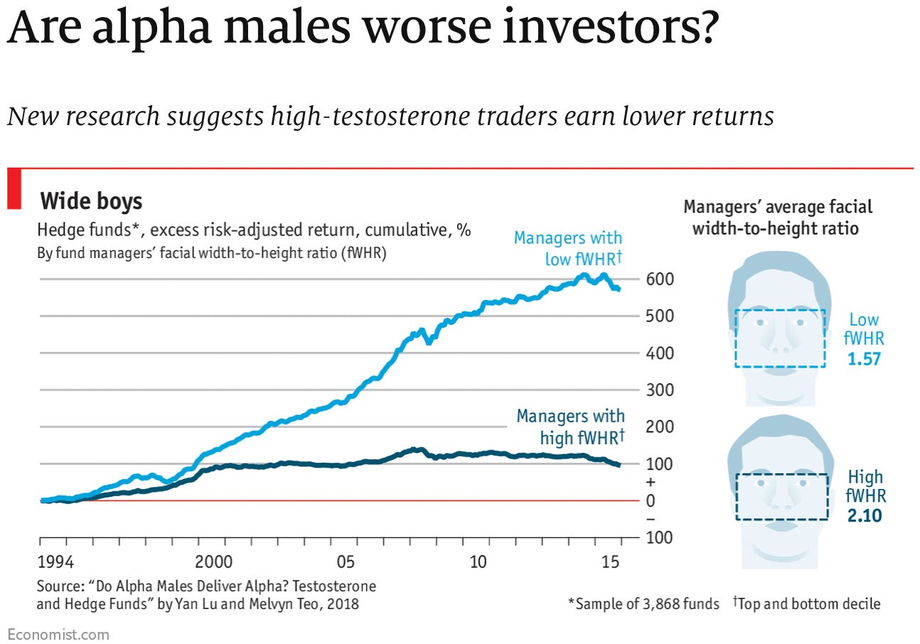
1. That is a crazy empirical result, and 2. Great illustration of fWHR!
Thanks to our sponsors!
Fishtown Analytics: Analytics Consulting for Startups
At Fishtown Analytics, we work with venture-funded startups to implement Redshift, Snowflake, Mode Analytics, and Looker. Want advanced analytics without needing to hire an entire data team? Let’s chat.
Stitch: Simple, Powerful ETL Built for Developers
Developers shouldn’t have to write ETL scripts. Consolidate your data in minutes. No API maintenance, scripting, cron jobs, or JSON wrangling required.
The internet's most useful data science articles. Curated with ❤️ by Tristan Handy.
If you don't want these updates anymore, please unsubscribe here.
If you were forwarded this newsletter and you like it, you can subscribe here.
Powered by Revue
915 Spring Garden St., Suite 500, Philadelphia, PA 19123

